As each new year unfolds, it brings with it a clean slate—a chance to refresh, renew, and reimagine the spaces we live in. Color plays a powerful role in this transformation, setting the mood and tone of our homes. From soft neutrals to bold statements, interior hues can define character, inspire emotion, and even influence our well-being. Whether you’re planning to repaint your entire home or simply revive a few accent walls, working with a professional painting service ensures a flawless execution of your vision.
The color palette for the new year is vibrant, yet grounded. There’s a shift towards nature-inspired tones, wellness-centered palettes, and artistic flair. Let’s explore the evolving color trends, how they resonate with current lifestyles, and practical ways to incorporate them into your interiors.
The Psychology Behind Color Choices
Before diving into swatches and finishes, it’s important to reflect on why certain colors resonate. Interior colors aren’t just decorative—they evoke feelings, memories, and energy. Warm tones like terracotta or honey promote comfort and intimacy. Cool tones such as ocean blue or sage create calmness and clarity. Meanwhile, vibrant accents like marigold or teal inspire creativity.
When selecting a new hue, it helps to ask:
-
What mood do I want this room to convey?
-
How much natural light enters the space?
-
What furniture or decor needs to complement the color?
The goal is to strike a balance between personal taste and functional harmony. A color might be trendy, but if it doesn’t align with the room’s purpose or your lifestyle, it can feel misplaced.
Color Trends Leading the Way
Color trends evolve based on cultural shifts, global events, and technological influences. The color story of this year is guided by a desire for serenity, flexibility, and individual expression. Here’s what’s leading the charge:
a. Organic Greens
Biophilic design continues to influence interiors. Shades like olive, eucalyptus, and moss are becoming staples for living rooms, bedrooms, and kitchens. These colors connect us to the outdoors, encouraging a sense of vitality and peace.
b. Warm Earth Tones
Muted terracottas, clay, sienna, and toasted almonds offer an earthy palette that’s both comforting and grounded. These tones work beautifully in dining areas and bedrooms, evoking a rustic, timeless feel.
c. Soft Neutrals with Depth
Neutrals are evolving. Instead of cold grays and sterile whites, we’re seeing mushroom, oatmilk, and sand-inspired tones that lend warmth without overwhelming the senses. They provide an elegant backdrop for layered textures and varied furnishings.
d. Muted Blues and Stormy Skies
Cooler tones like slate, dusky blue, and periwinkle provide a tranquil escape. Ideal for bathrooms and study rooms, these colors promote introspection and calm.
e. Bold Accents for the Brave
If you’re inclined to make a statement, saturated colors like cobalt, paprika, deep teal, and marigold are making waves. These are perfect for accent walls, cabinetry, or feature ceilings.
Color by Room: Strategic Choices
The same shade doesn’t always work across the entire home. Each room has its purpose and energy. Here’s how to tailor colors room by room:
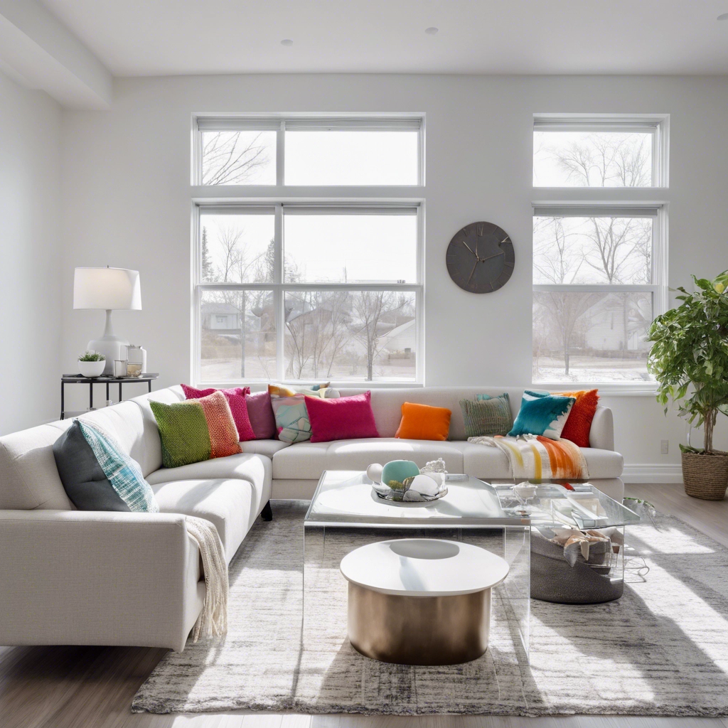
Living Room
This shared space is a canvas for comfort and conversation. Rich greens, dusky blues, and warm beiges provide a sophisticated, relaxed setting. Consider incorporating textured paint finishes to add dimension.
Kitchen
Traditionally whitewashed, kitchens are now embracing color. Sage green cabinetry, matte black walls, or terracotta accents can make the space feel alive. A two-tone approach—lighter uppers and darker lowers—adds both height and depth.
Bedroom
A place of retreat, the bedroom benefits from gentle, restful tones. Soft lavenders, rosewood, or mocha create intimacy. Pair with dimmable lighting and soft furnishings for a complete sensory experience.
Bathroom
Modern bathrooms are moving away from stark white. Seafoam green, smoky charcoal, or pale coral make the space feel more like a spa than a utility room. Paint-resistant coatings can ensure durability.
Home Office
Color influences productivity. Blues sharpen focus, while greens foster calm. If creativity is central to your work, mustard or burnt orange might help inspire bold thinking.
Accent Walls and Color Blocking
One of the easiest ways to experiment with new hues is through accent walls. These are ideal for breaking up open-plan spaces or drawing attention to architectural features. For example:
-
A navy wall behind a cream sofa adds depth.
-
A mustard stripe across an entryway injects energy.
-
A painted ceiling in blush or sage can redefine a compact room.
Color blocking—painting multiple colors within the same space—allows for more playful, geometric design. It’s especially effective in children’s rooms, creative studios, or hallway niches.
Finish Matters: More Than Just Matte or Gloss
While color sets the tone, the finish brings it to life. Each finish interacts differently with light and texture:
-
Matte: Ideal for walls with imperfections. It absorbs light and gives a soft, sophisticated look.
-
Eggshell: Slightly more reflective and easier to clean, great for living spaces.
-
Satin: Has a gentle sheen. Works well in high-traffic areas.
-
Semi-gloss: Durable and light-reflective. Perfect for kitchens and bathrooms.
-
Gloss: Best used sparingly. Great for doors, trim, or cabinetry.
Experimenting with different finishes can add contrast without changing the color itself. For instance, a matte wall with a gloss trim in the same hue creates subtle visual interest.
Layering Color with Texture and Light
A well-painted room becomes even more dynamic when combined with thoughtful textures and lighting. Natural textures like rattan, wool, and wood grain enhance earth-toned walls. Velvet cushions, linen drapes, and ceramic accents can soften cooler shades.
Lighting also plays a crucial role. North-facing rooms tend to be cooler and benefit from warmer tones. South-facing rooms, flooded with natural light, can handle darker, bolder colors without feeling oppressive.
Accent lighting—such as sconces, uplighting, or pendant fixtures—can amplify the richness of the paint, especially if the finish has a sheen.
Sustainable and Wellness-Oriented Choices
Homeowners are now more mindful about health and sustainability. This extends to paint choices as well. Low-VOC or zero-VOC paints reduce indoor air pollution and are safer for children, pets, and those with allergies.
In addition, colors associated with wellness—like sky blue, sea green, and warm neutrals—help create spaces that support mental clarity and emotional balance. These are ideal for meditation rooms, reading nooks, or yoga spaces.
Cultural and Regional Influences
Color preferences often reflect regional heritage and climate. In warmer areas, cooler tones like mint, aqua, and pale gray are used to counteract the heat. In colder regions, warm colors such as rust, amber, and cocoa are more prevalent to create a sense of coziness.
Cultural aesthetics also play a role. Mediterranean interiors embrace ochres and sea blues. Scandinavian styles lean into crisp whites, ash grays, and muted greens. Modern bohemian spaces layer vibrant jewel tones with natural textures and global patterns.
Blending these influences while maintaining a personal touch can create a space that feels both global and grounded.
Pairing Color with Modern Interior Styles
A successful color scheme also aligns with the home’s architectural and design style. Some pairings to consider:
-
Minimalist: Stick with monochromatic palettes—warm whites, soft grays, and subtle pastels.
-
Mid-century Modern: Burnt orange, olive green, and mustard shine in this retro revival.
-
Industrial: Charcoal, black, rust, and cement gray offer a raw, edgy aesthetic.
-
Traditional: Navy, forest green, and burgundy create depth and elegance.
-
Coastal: Sand, seafoam, and sky blue maintain a breezy openness.
The key is harmony between paint, materials, furniture, and natural light. When done right, even unconventional color pairings can feel cohesive.
Mistakes to Avoid When Choosing New Colors
While color brings joy and transformation, some common pitfalls can hinder the outcome:
-
Ignoring undertones: A gray may have blue, green, or purple undertones that shift based on lighting.
-
Testing on small swatches only: Always paint a larger test area on different walls before committing.
-
Skipping primer: Primer ensures true color payoff, especially when painting over bold or dark shades.
-
Choosing based on trend alone: Trends come and go. The color should align with your lifestyle and preferences.
-
Neglecting the ceiling and trim: These can either highlight or detract from your walls. Make them part of the design conversation.
Timeless vs. Trendy: Finding Balance
Not every space needs to chase trends. Some colors remain timeless for a reason. Soft taupes, creamy whites, and dusty blues have enduring appeal. If you’re drawn to bold hues, consider using them in smaller doses through accessories, artwork, or single walls.
Balancing timeless and trendy ensures your space feels fresh without frequent repainting. Think of paint as part of a larger story that includes furniture, textiles, and lighting.
Planning a New Year Paint Project
A fresh coat of paint can breathe new life into any room. Before picking up a brush, consider the following steps:
-
Define your goals – Is it a refresh or a full transformation?
-
Assess your space – Take lighting, ceiling height, and existing decor into account.
-
Choose your palette – Start with one or two core colors, then layer in accents.
-
Test samples – Always test in natural and artificial light.
-
Work with professionals – A well-executed paint job saves time and ensures a long-lasting result.
Why Choose Precision Painting?
Precision Painting isn’t just about putting color on walls—it’s about crafting an experience. Every home tells a story, and the right hue amplifies its message. Our team works closely with homeowners, designers, and contractors to bring visions to life with professionalism and artistry. From selecting palettes that elevate interiors to applying each coat with care and precision, our work reflects a passion for detail and a commitment to excellence.
Whether you’re envisioning a subtle refresh or a bold transformation, Precision Painting is here to deliver quality that lasts and beauty that inspires.
